A car is recognizable in so many ways. From the sound of it’s torque to the details of it’s interior. But all too often is ignored maybe the most nostalgic part about automobiles: the logos.
Usually, one would preface the rest of their article with “not to be confused with _____.” Yet, in this case, I wouldn’t mind you confusing logos (emblems used by a company to represent their brand) with logos (the rational principle personified as the source of order in the universe.)
The reason why is because logos have logos!
That’s a little confusing so let me explain, real quickly. A logo “personifies” everything that makes sense in the universe of a brand. We see three circles, and therefore, believe Mickey Mouse is “well-rounded.” Coca-Cola has a classic smoothness about itself to the point where it’s cursive is just as refreshing yet reliable as the drink that’s been around since 1892.
That’s not to say all logos go to heaven. Companies shut down, dissimilate or get bought out. But the really great corporations have the benefit of having a design that sticks out.
And luckily for logos, the automotive industry is full of finish-line winners, no matter their checkered-flag past.
When you see a logo on a car’s bumper, steering wheel or even driver’s manual, you’re looking at history. Decades of modern ingenuity that collect into one unforgettable figure. A calling card harkening to that ambitious drive out onto the highway of the motorized business. As a company grows older, so too does the logo mature. But as with wine, it tends to become less insecure and more pure with age.
Vanmonster, a van rental service out of the United Kingdom, put these logos to the test. 100 particpants were to draw each logo asked of them by memory. The results, as you can imagine, vary from unmistakable to unforgivable.
Alfa Romeo
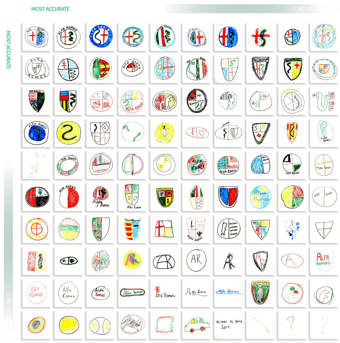
The mechanics of these drawings have my smile full of rollicking emotions… Also, do you think those missing snakes are on a plane? Perhaps, they’re on vacation in the Italian Riviera.
Audi
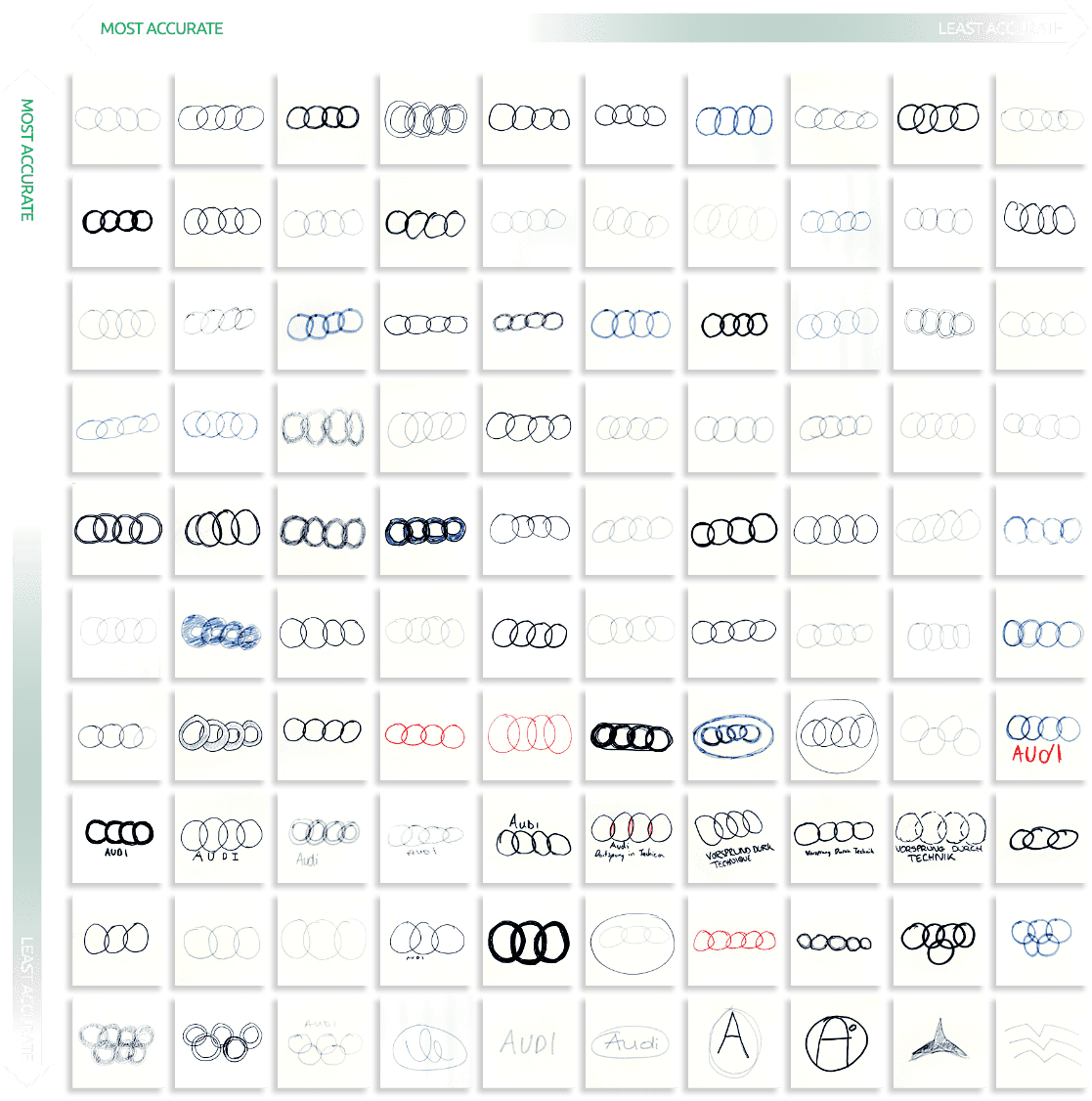
We may be another year before the Olympics come back but our true destiny rings in a hope that much like a magician, everything about 2020 can disappear quicker than these folks’ memory. (It’s four circles! C’mon!)
BMW
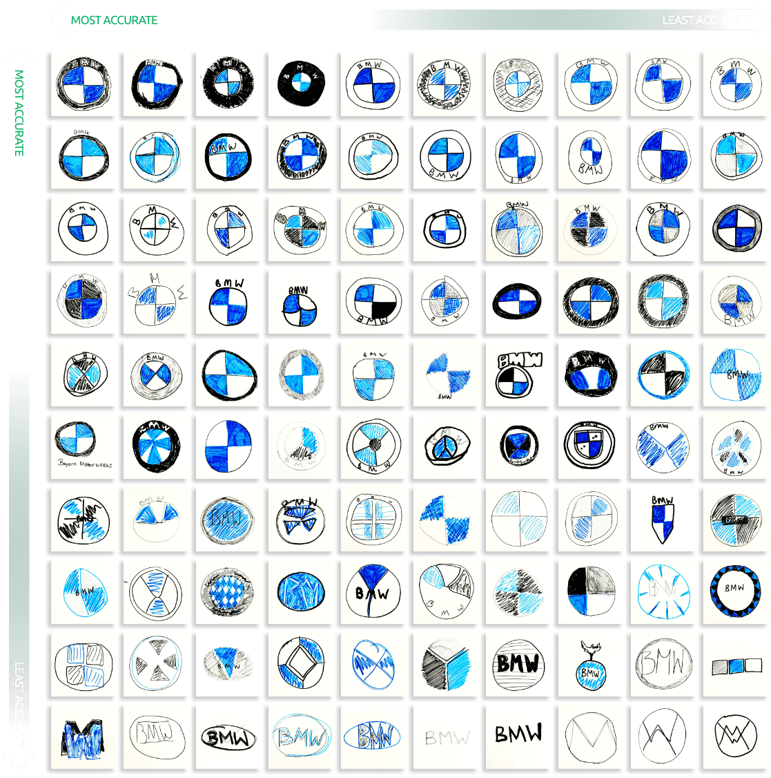
Fun fact: I used to think BMW was British. But I should’ve known that their preferred transportation wouldn’t allow their passengers to be so black and blue if ever involved in a car accident. Someone stop me when I’m being a wanker.
Ferrari
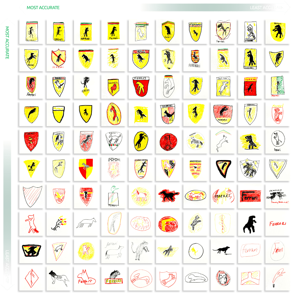
Enzo Ferrari drew the trademark horse on his racecar to bring him good luck. That said, I wonder how many of these doodlers had a tattoo of a horse with broken legs when trying to recall only the coolest car brand ever.
Ford
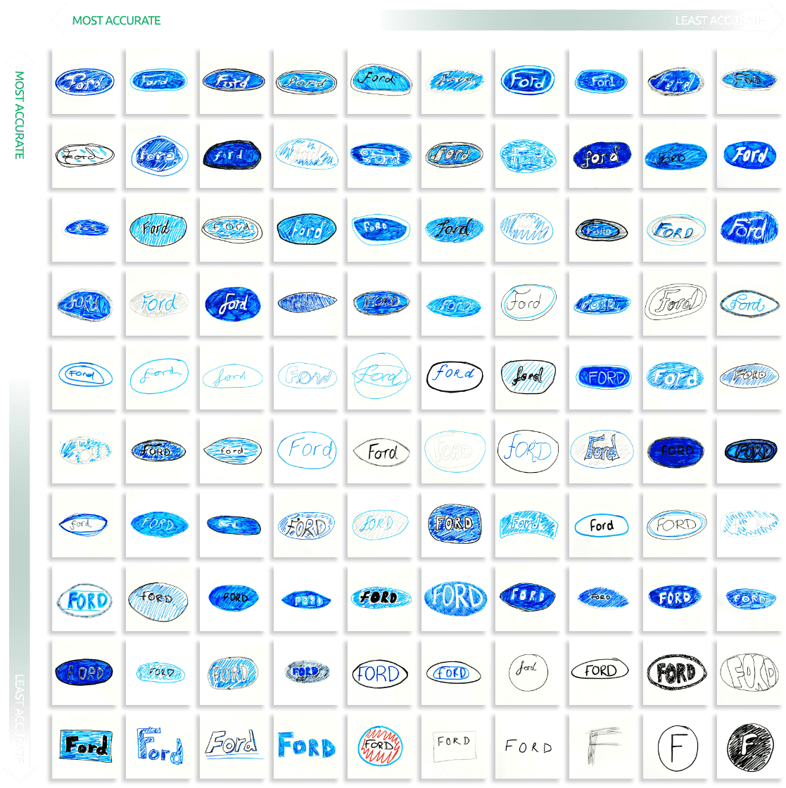
Okay, I have my doubts about this one. Have you ever heard of the Mandela effect? Basically, there’s a theory that if time travel is indeed possible in the future, then small details of our past are being altered in all-too-realtime. That said, the “F” didn’t have that loop!
Peugeot
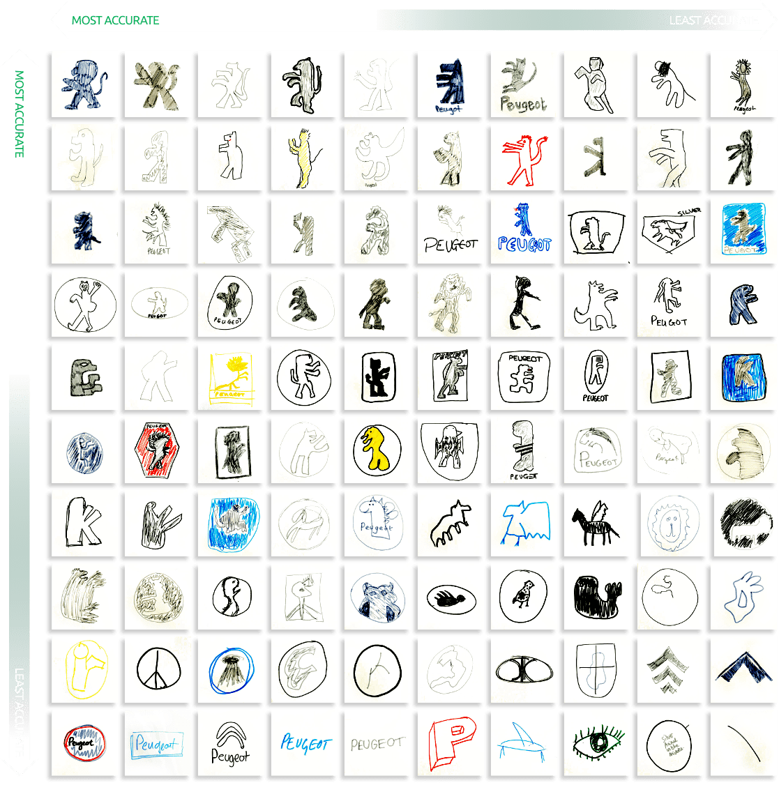
I know having a ferocious animal on the logo is part of the appeal of having a “beast of a machine” to drive. Yet, the less threatening the Peugeot lion appears, the more I actually want to move to France and drive a 508 PSE!
Renault
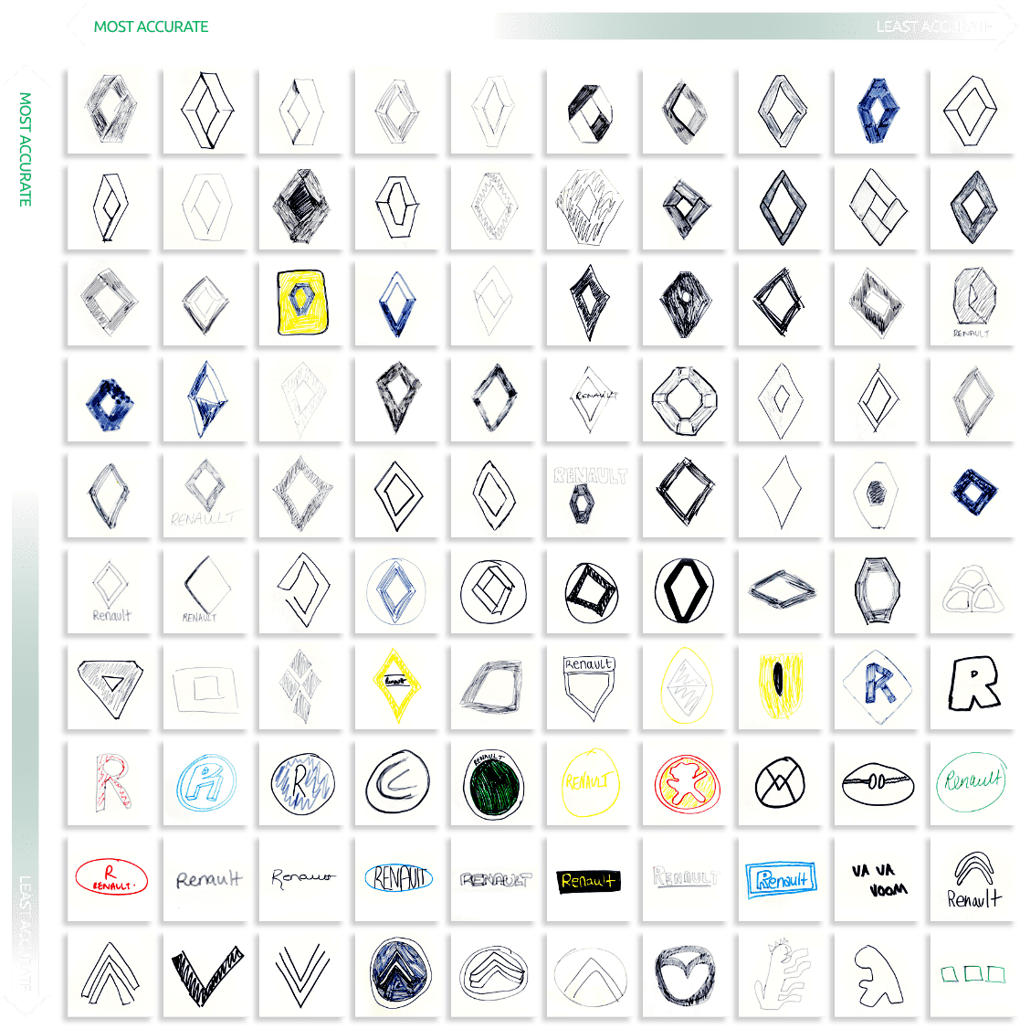
How do you mess up a diamond? I’d expect this type of result from the Americans but if you live on a continent where they charge extra for mayonnaise and drive on the left, how can’t you know geometry by now?
Toyota
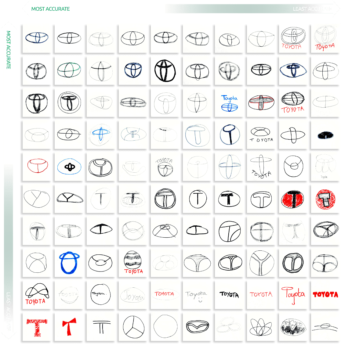
They say you can spot each letter of Toyota in the logo itself. If that’s not a philosophical phenomenon, I don’t know what is. I have a lot of admiration for this company’s logo, originating from a public competition back in 1989. Just be glad none of these disaster artists made the cut!
Vauxhall
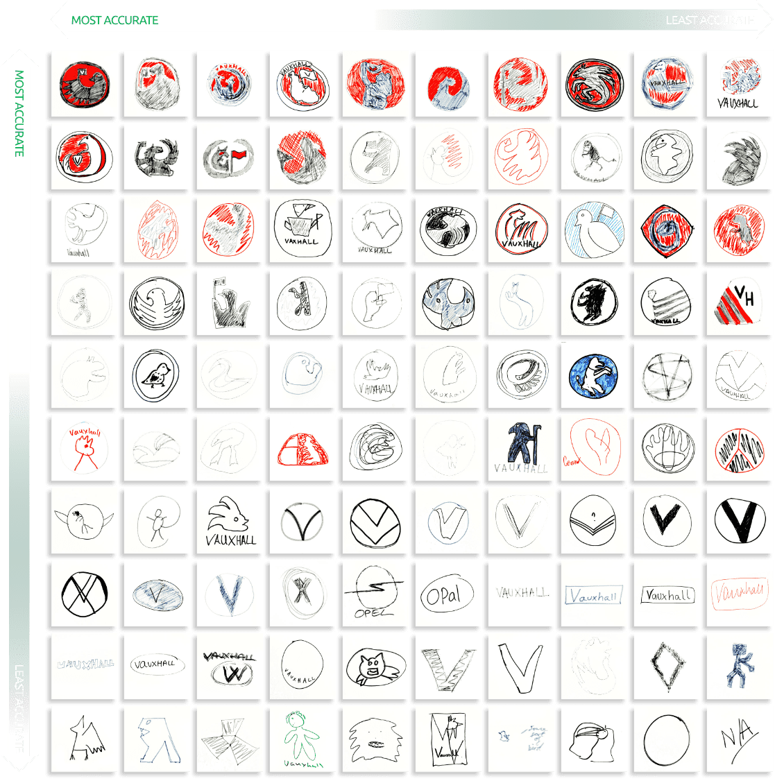
Up until today, I haven’t even heard of Vauxhall. But the company rings true of excellence, affordability and defiance against all odds. What bothers me is that none of these ne’er-doodle-wells had it in them themselves! I guess not everyone can be an eagle-bear thing.
Volkswagen
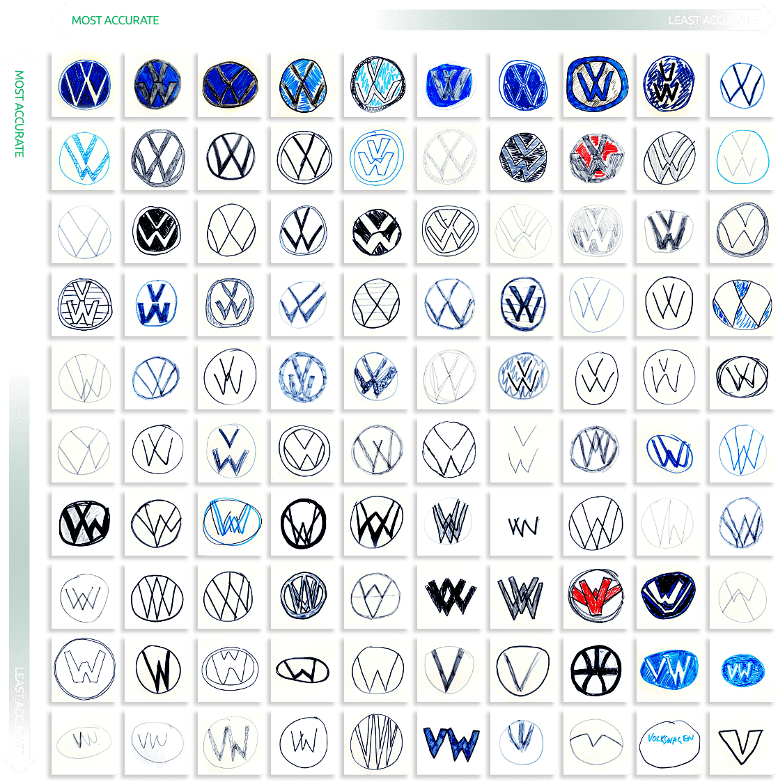
This is by far the best pool of results out of wall the entries. There’s the “V,” the “W” and the blue for the win! What could possibly be wrong with Volkswagen besides being founded by Hitler’s German Labour Front?
For a more in-depth look at this amusing study, refer to Vanmonster’s original post here.
